Proterat
Turning an anxious, urgent call into a calm, documented process, from the first sign of pests to the final follow-up report.
The context
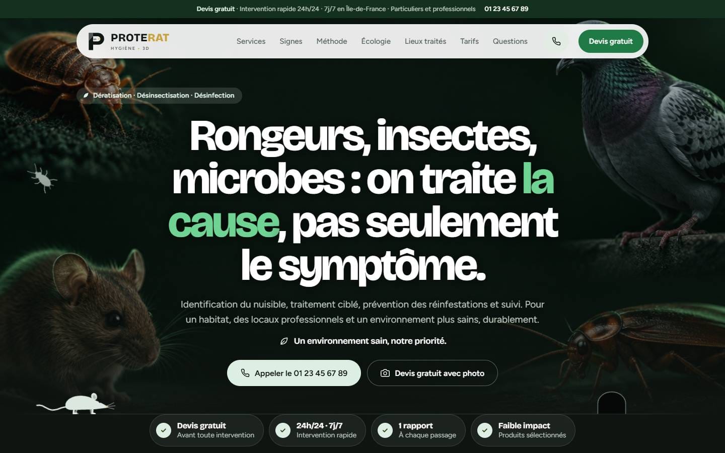
Proterat provides rodent control, insect control and disinfection for homes, co-ownerships, food businesses, schools and local authorities across Île-de-France. The one-page website presents the three services, explains the method, publishes indicative prices and leads to a free quote or a booked appointment.
The initial challenge
Pest control is a market of urgency and distrust: visitors are stressed, embarrassed and wary of opaque pricing. The site had to reassure quickly, prove seriousness without technical jargon, and differentiate Proterat through what most competitors never show: prevention and written follow-up.
The audience
Private households facing a sudden infestation, as well as property managers, landlords, restaurants and schools who need traceability for hygiene inspections. All of them want to know what is happening, what it will cost and what proof they will receive.
Objectives
Every objective tied
to a decision.
Defuse the urgency
A direct promise, visible contact options and a quick self-assessment help visitors understand their situation before calling.
Show the method, not just the treatment
A four-step sequence (diagnosis, targeted treatment, prevention, follow-up) makes the difference with a one-off intervention explicit.
Make proof tangible
A sample intervention report and site plan show professional clients exactly what they will receive after each visit.
Remove price anxiety
Indicative prices per service and per type of property are published before any commitment, with the final price set in the free quote.
A journey designed
to build confidence.
- 01
Name the problem and the promise
- 02
Recognise the three warning signs
- 03
Present the three services
- 04
Self-assess in 30 seconds
- 05
Explain the four-step method
- 06
Show the intervention report
- 07
Clarify prices and book a slot
Creative direction
An identity serving
the positioning.
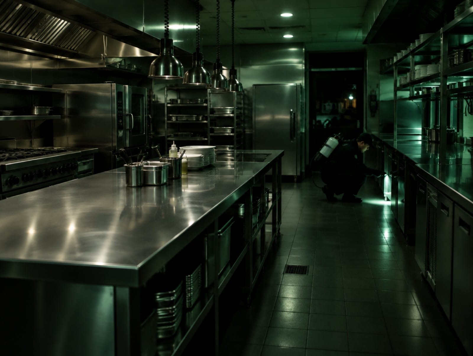
A deep forest green replaces the alarming imagery usually associated with the sector: it evokes hygiene, nature and control. Night-lit, cinematic photography gives the subject a serious, almost investigative tone, while pale sage surfaces keep long explanations calm and readable. Bricolage Grotesque brings character to the headlines; Figtree keeps the interface clear.
#0F1712#14301F#17633A#2FA35A#DDEFE3#F3F6F1Bricolage Grotesque / Figtree
Key interface decisions
Design as a
strategic tool.
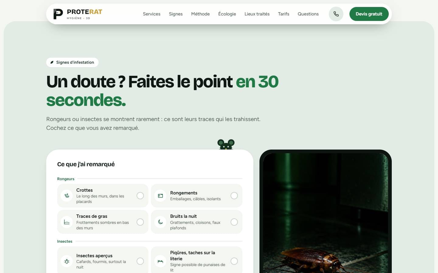
Interactive warning-sign checklist
Visitors tick what they have noticed and receive a general urgency level with the next step, clearly labelled as no substitute for an on-site diagnosis.
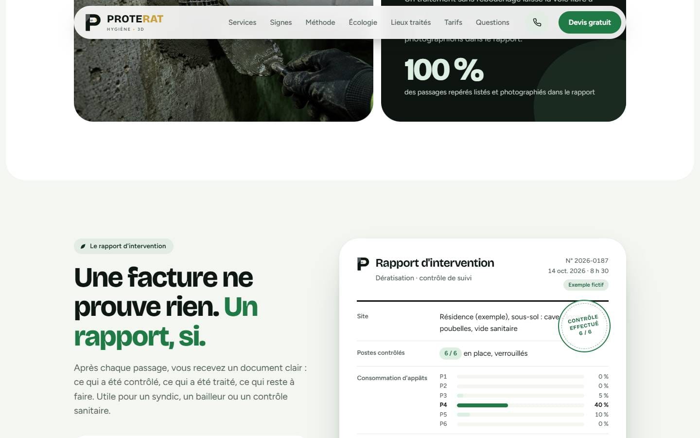
A report as the core argument
“An invoice proves nothing. A report does.” A sample report with bait consumption per station, a numbered site plan and corrective actions turns a promise into a deliverable.
Prevention given its own chapter
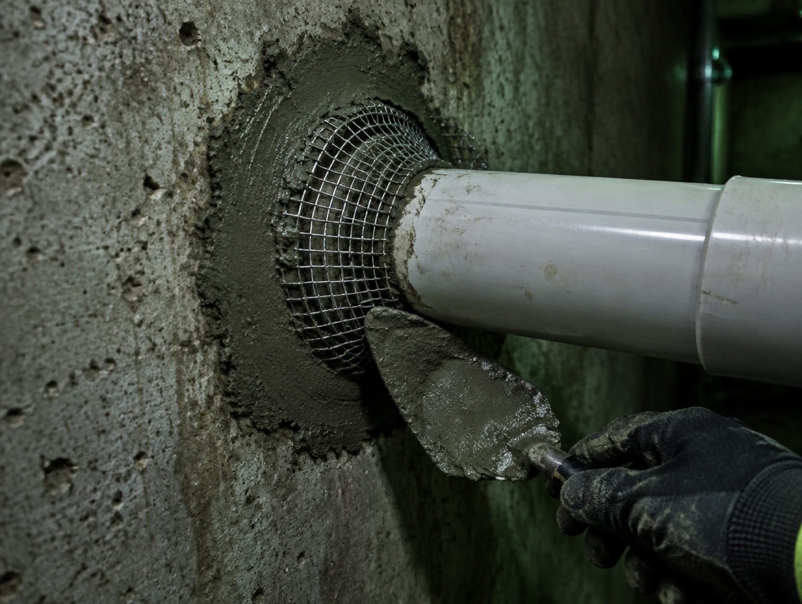
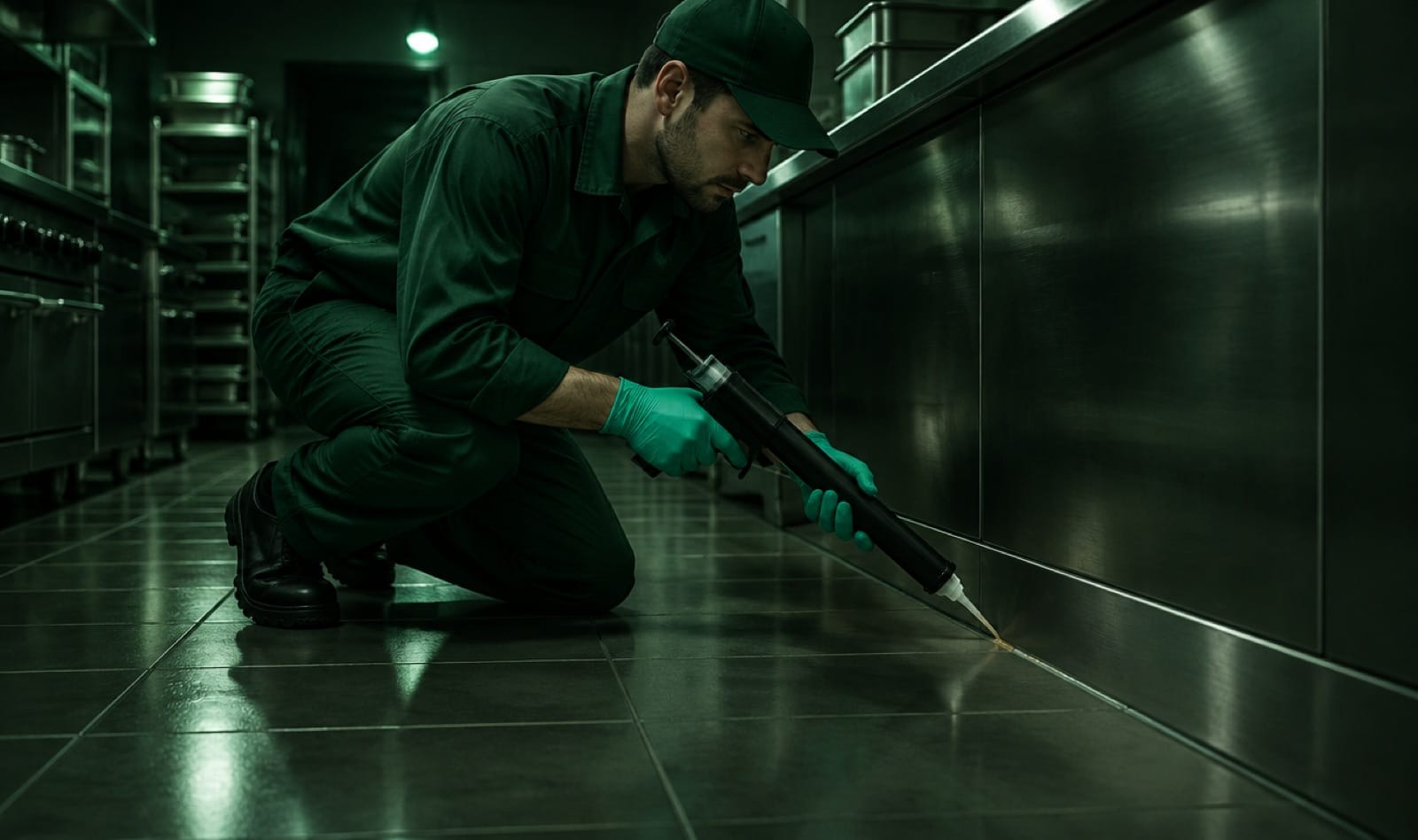
Sealing entry points, the step many providers skip, is shown in detail with photography, making the long-term value visible.
Content by type of place
Homes, co-ownerships, food businesses, schools and local authorities each get adapted constraints, arguments and common pests.
Clearly labelled examples
Every illustrative document is marked as a fictitious example, so demonstration never becomes misleading.
A foundation built
to last.
Development
A bespoke WordPress theme built as a single long-form page with anchored navigation. The self-assessment checklist, the sample report, the basement plan and the pricing tables are coded components rather than flat images, so they stay sharp, responsive and editable.
Motion & interaction
Interactions serve comprehension: the checklist updates the urgency level as signs are ticked, the method steps read as a sequence and the FAQ expands on demand. Nothing animated stands between a stressed visitor and the phone number.
SEO & performance
A single H1 states the three services, each chapter has its own H2, and every photograph carries a descriptive alternative text. Page metadata, WebSite and BreadcrumbList structured data are in place. No unverified ranking or speed claim is made.
Challenges & solutions
Solve with
intention.
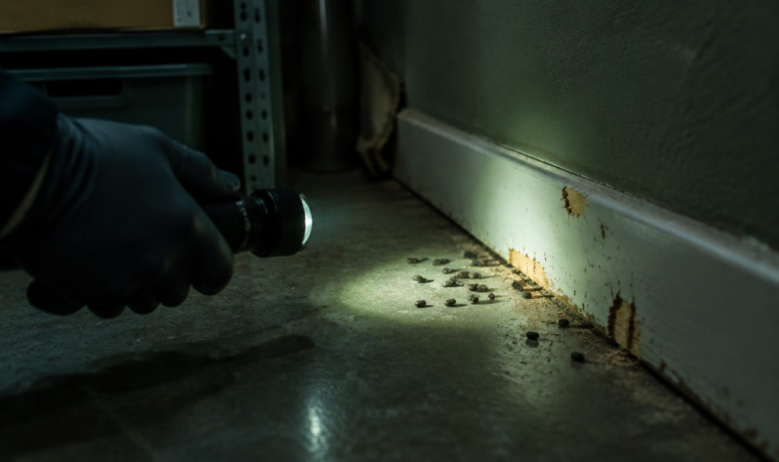
A sector associated with disgust
Explicit imagery could repel visitors before they read anything.
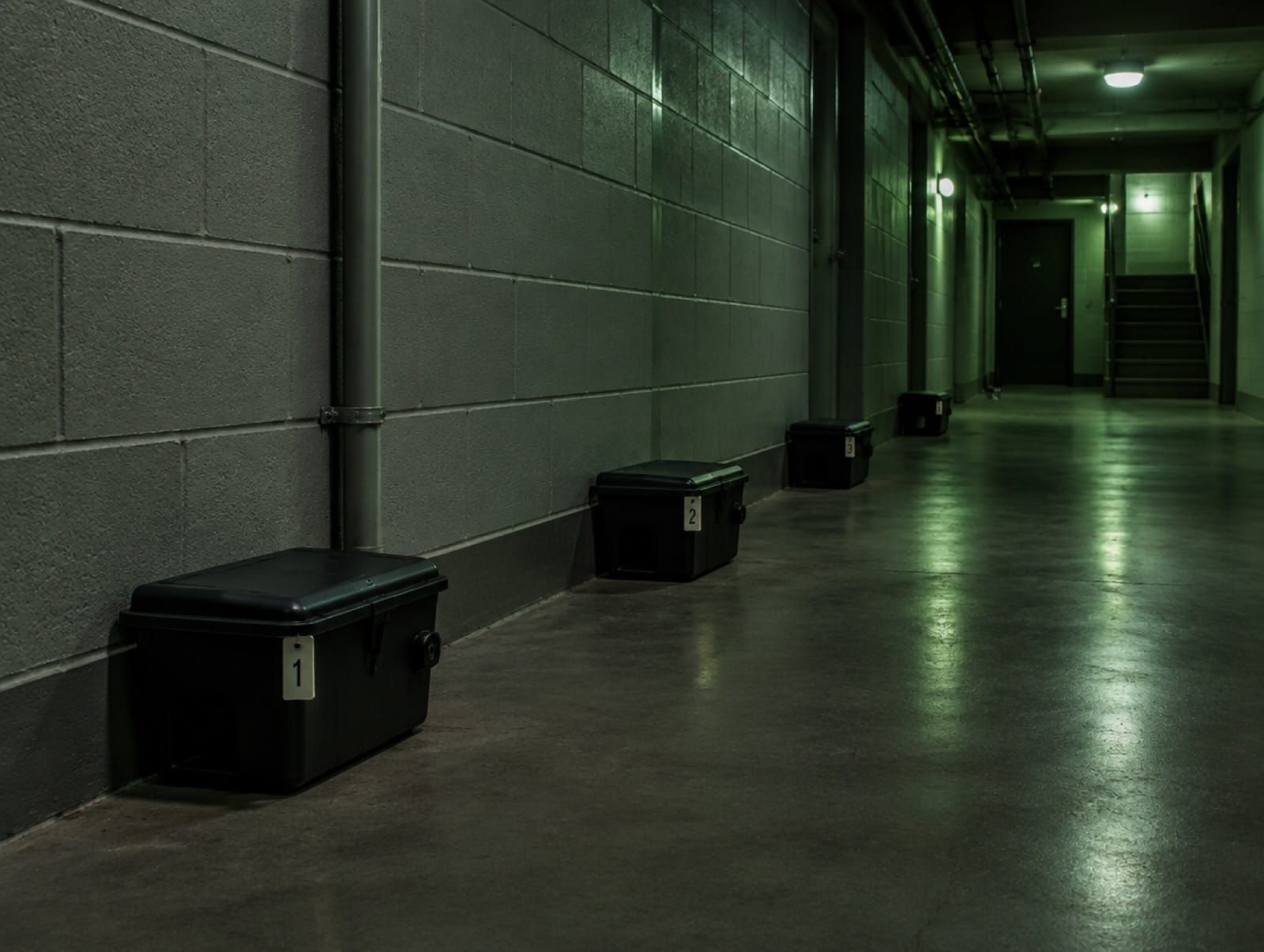
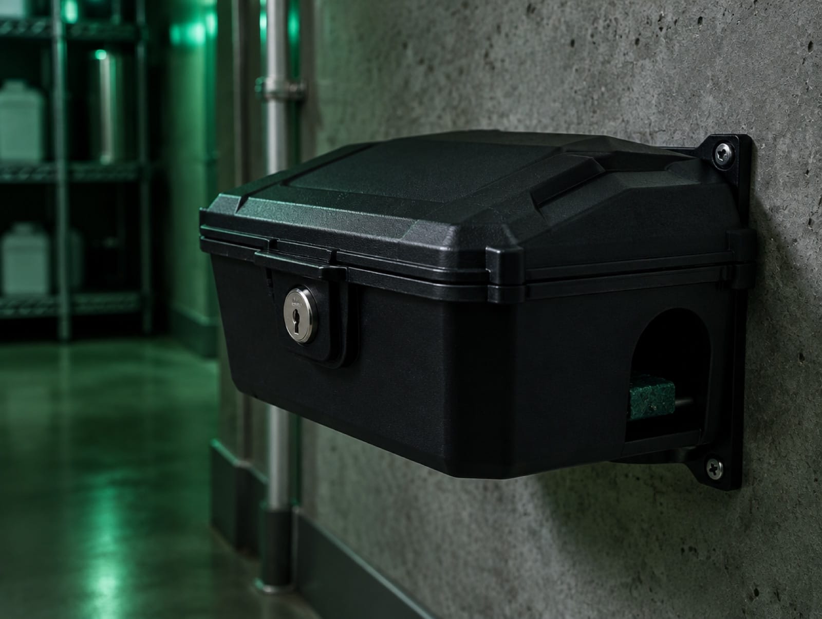
Dark, controlled photography focuses on the technician, the equipment and the method rather than on the pests themselves.
The subject is treated seriously without being repulsive.
Proving quality before the visit
Every competitor claims to be fast and effective.
The site shows the deliverables: a structured report, a site plan and photographed sealing work.
Seriousness becomes something visitors can see, not just read.
Very different audiences
A worried tenant and a restaurant manager do not need the same arguments.
A “You are…” selector adapts constraints, arguments and pests to each type of place.
Each visitor quickly finds the part that concerns them.
What this project
taught us.
In a market driven by urgency, the strongest differentiator is not speed but traceability. Showing what happens after the treatment (prevention, reports, follow-up) reframes the service as long-term protection. Real intervention photographs, contact details and verified customer reviews will complete this foundation as the business publishes them.
Next case study
Protea Serrurerie↗︎