Protea Serrurerie
A locksmith website built around one promise visitors rarely believe: the price you are quoted is the price you pay.
The context
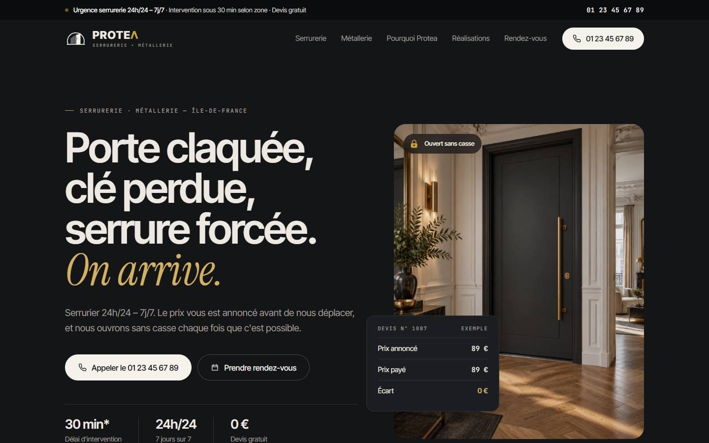
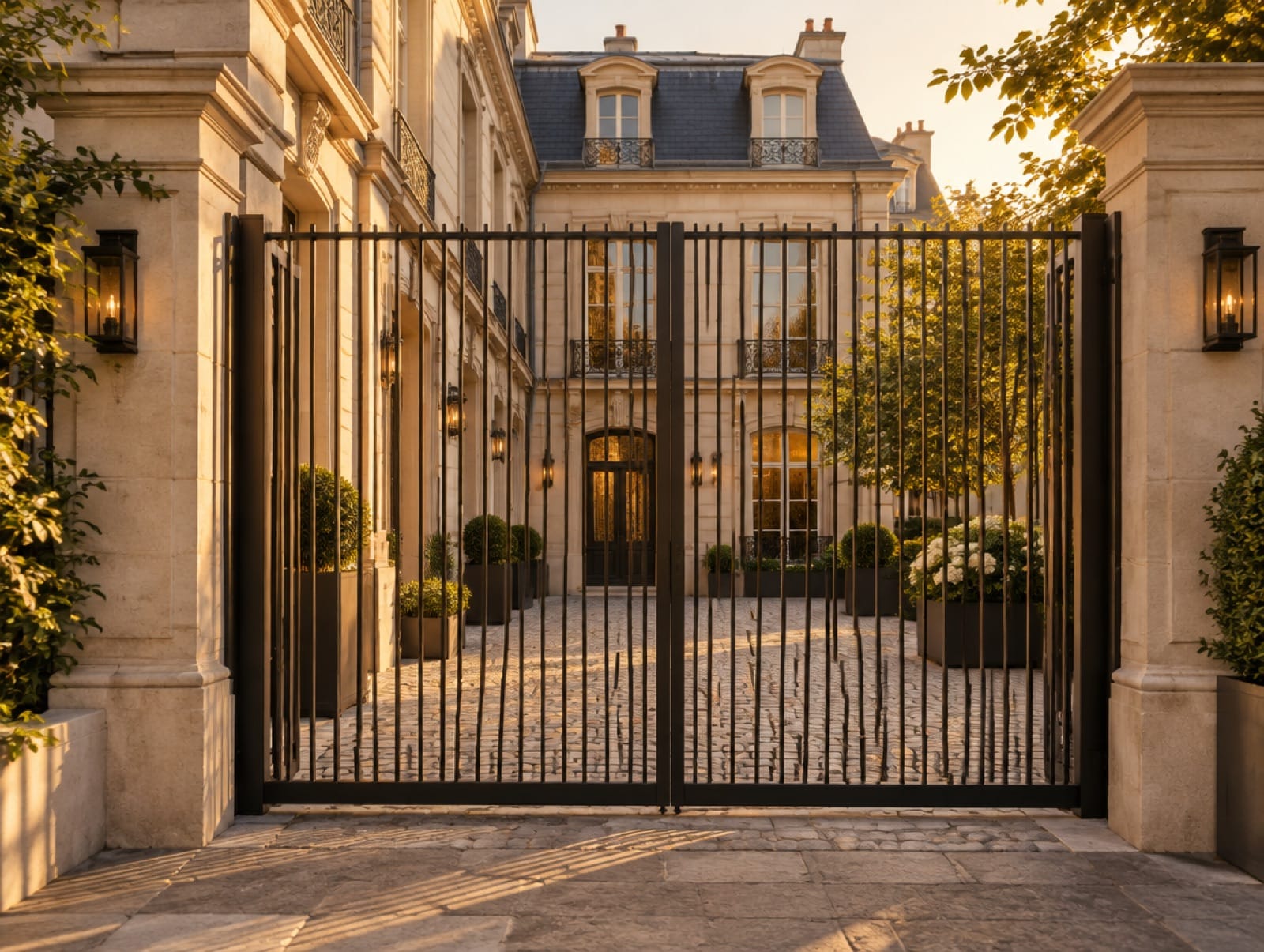
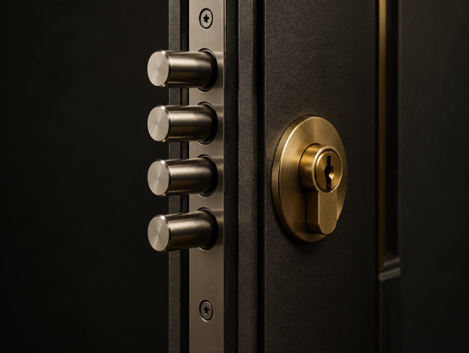
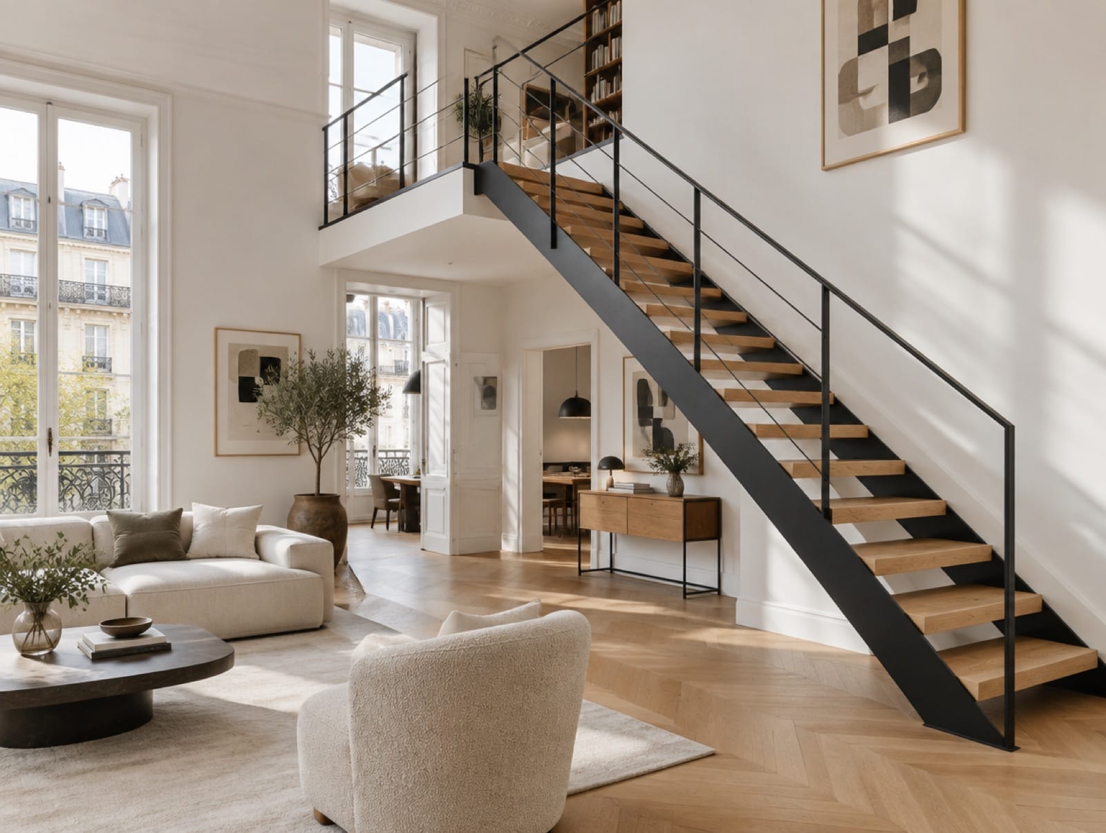
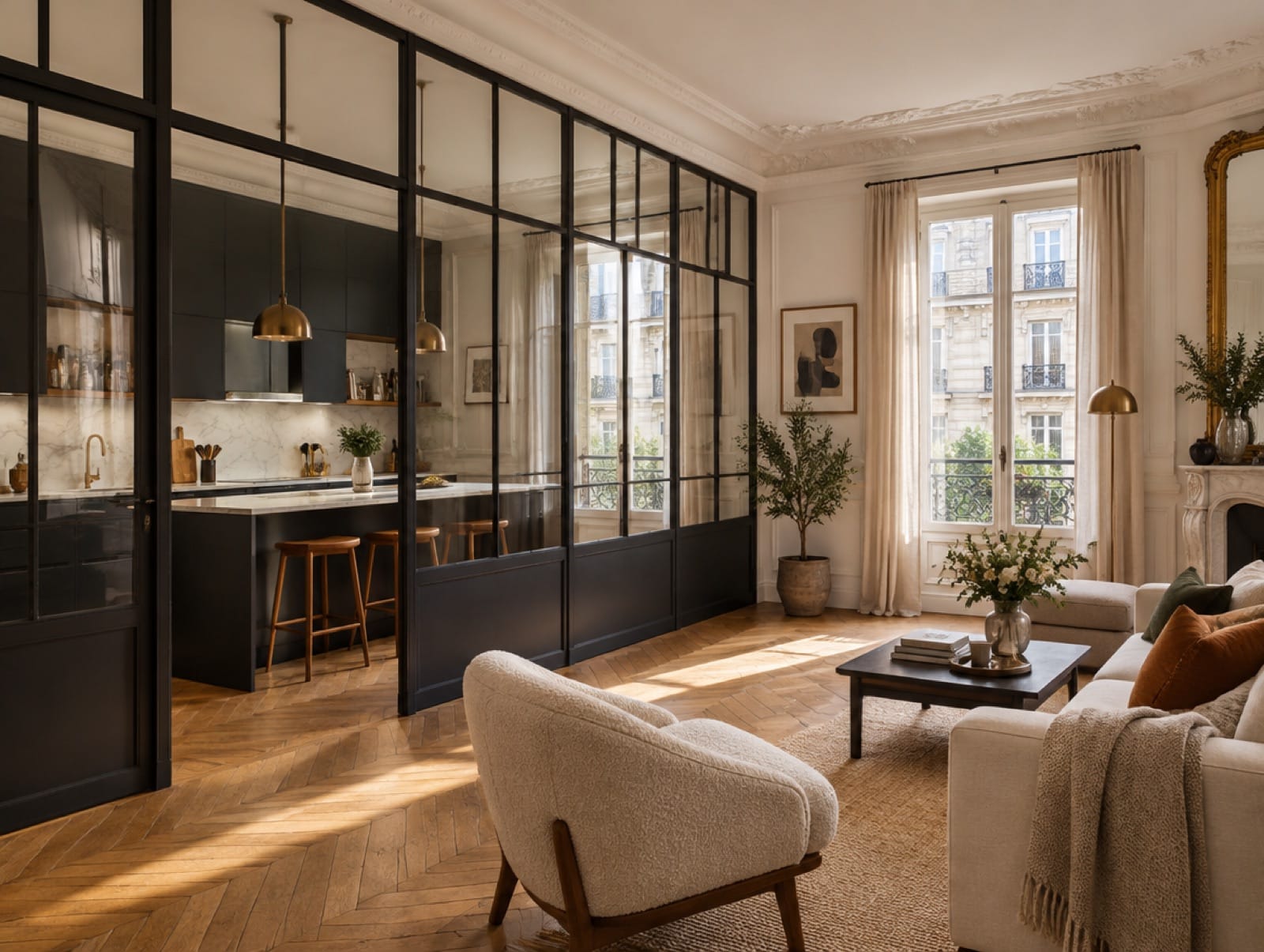
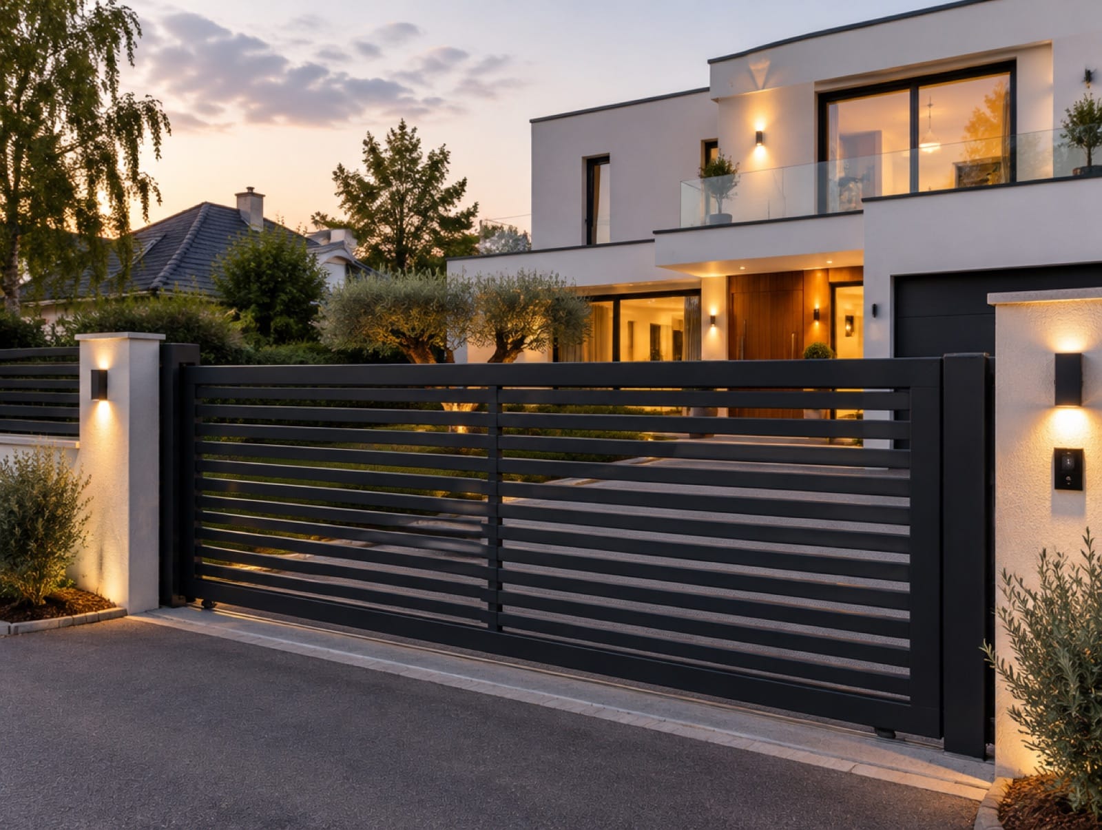
Protea combines emergency locksmithing (door opening, lock and cylinder replacement, armoured doors, key systems and access control) with bespoke metalwork such as gates, railings, staircases and glass partitions, across Île-de-France. The one-page website covers both trades, publishes indicative prices and leads to a phone call or a booked appointment.
The initial challenge
Emergency locksmithing suffers from a deep trust problem: people locked out at night fear inflated bills. Protea also needed to present a second, slower trade, made-to-measure metalwork, without diluting the urgency of the first.
The audience
Individuals locked out or recovering from a break-in, who need a fast and honest answer; and property managers, shops, local authorities and homeowners planning a security upgrade or a metalwork project.
Objectives
Every objective tied
to a decision.
Answer the emergency instantly
The headline names the three typical situations and the phone number stays within reach throughout the page.
Make pricing a proof of honesty
Published indicative prices, a quote accepted before any work and a signed intervention form turn transparency into the main argument.
Give metalwork its own stage
A dedicated chapter with its own four-step process presents bespoke projects as a craft, not a side service.
Offer the right next step
Urgent call, planned intervention, on-site measurement or advice call: each intention has a clear route.
A journey designed
to build confidence.
- 01
Name the emergency and promise to come
- 02
Present the locksmith services
- 03
Publish indicative prices
- 04
Introduce bespoke metalwork
- 05
Show the signed intervention form
- 06
Explain the four steps
- 07
Choose a slot or call
Creative direction
An identity serving
the positioning.
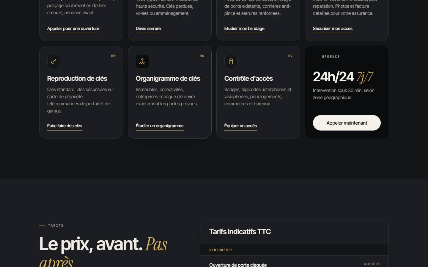
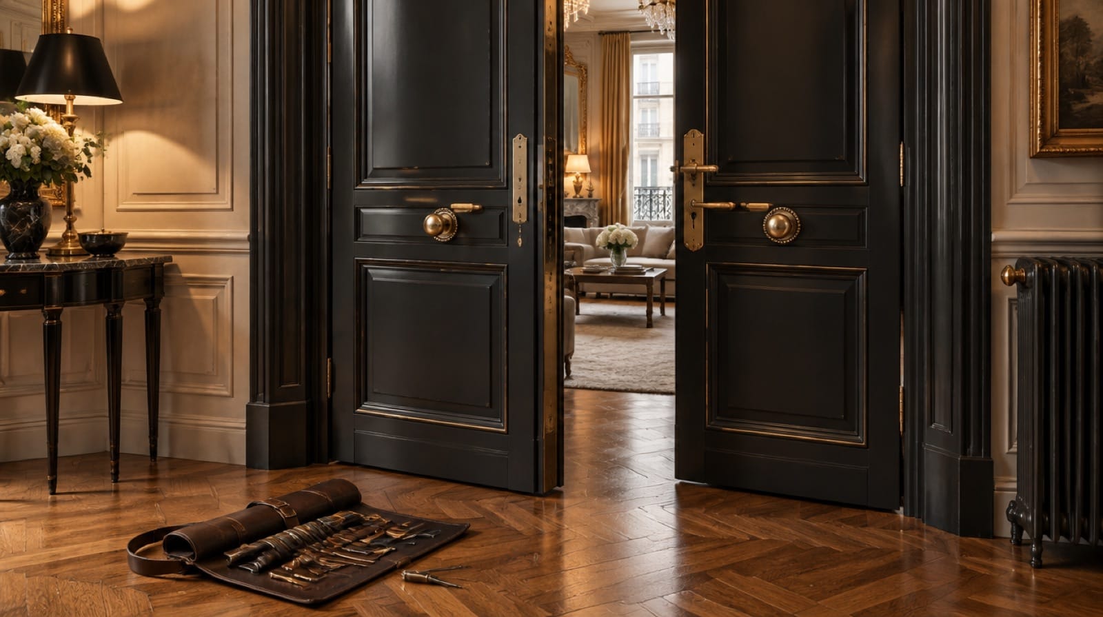
A night-time palette of anthracite and black, lit by brushed brass, borrows from the materials of the trade itself: steel, cylinders and keys. Instrument Serif italics bring a refined, almost hospitality-like warmth to a sector known for aggressive advertising, while Inter Tight and JetBrains Mono give documents and prices a precise, technical voice.
#0B0C0D#1B1D20#C9A13B#D4B160#EDE9E2#A29F98Inter Tight / Instrument Serif / JetBrains Mono
Key interface decisions
Design as a
strategic tool.
“Quoted price = price paid” as a signature
A small hero card compares the announced and paid price, with a zero difference: the brand promise becomes a visual element repeated across the page.
A price table, not a “call us”
Door opening, cylinders, keys and surcharges are listed with indicative prices, and every surcharge is announced before travelling.
The intervention form as proof
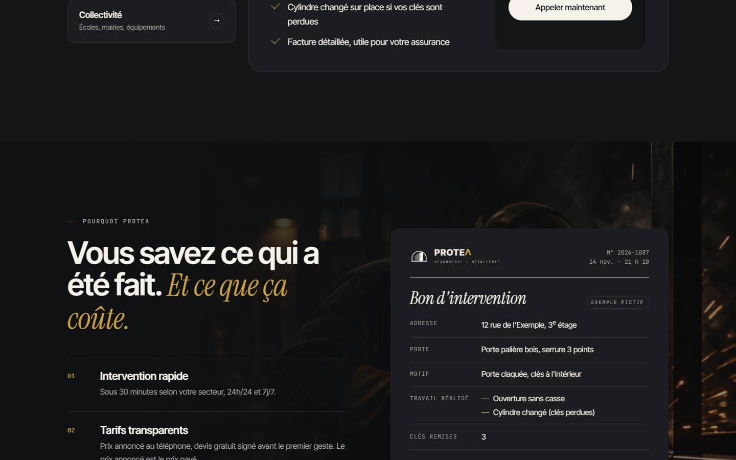
A sample signed form (work done, parts fitted, keys handed over, matching prices) shows what the client keeps after the visit.
Two trades, two rhythms
Locksmithing is presented as an immediate response; metalwork follows its own slower sequence from survey to installation.
A three-step booking flow
Appointment type, time slot and contact details are separated, with arrival windows and reminders explained upfront.
A foundation built
to last.
Development
A bespoke WordPress theme structured as a single long-form page with anchored navigation. The price comparison card, the services ticker, the price table, the intervention form, the coverage map and the booking steps are coded components that stay sharp and responsive on every screen.
Motion & interaction
An opening sequence reveals the promise, and a continuous ticker lists every service without adding reading effort. Elsewhere, motion stays discreet: the FAQ opens on demand and the booking flow progresses step by step.
SEO & performance
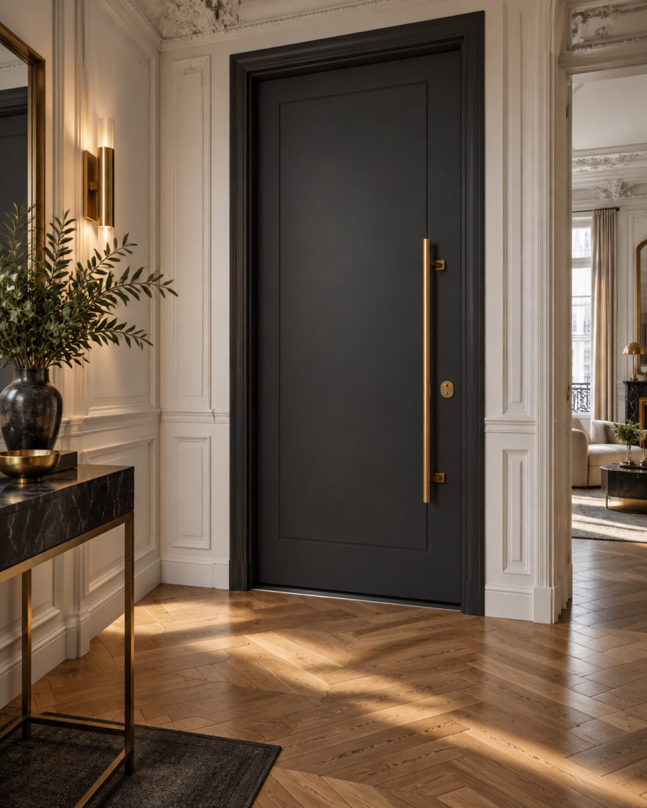
A single H1 states the emergency situations, each trade and chapter has its own heading, and every photograph carries a descriptive alternative text. Page metadata, WebSite and BreadcrumbList structured data are in place. No unverified ranking or speed claim is made.
Challenges & solutions
Solve with
intention.
A sector with a bad reputation
Visitors expect hidden fees and inflated night-time bills.
Prices, surcharges and the signed quote are shown before any contact, and the promise is repeated as a visual signature.
Transparency becomes the reason to call Protea rather than another number.
Urgency and craft on one page
Emergency calls and bespoke projects follow completely different decision cycles.
Each trade gets its own chapter, process and calls to action.
The emergency path stays short while metalwork gets the depth it needs.
A premium image without distance
A refined aesthetic could feel expensive to someone locked out.
Brass and serif details are balanced with direct language and visible “from” prices.
The brand feels trustworthy and accessible at the same time.
What this project
taught us.
In emergency services, the design does not need to shout: it needs to remove doubt. Turning the price promise into a recurring visual signature proved more persuasive than any urgency badge. Real project photography, final contact details and verified Google reviews will complete the experience as the business publishes them.
Next case study
EvidMind Academy↗︎